01
Families arranging care
Need service information, trust signals, an easy way to begin a discussion, and a clear sense of what happens next.
Understand → Evaluate → Book
Health & social care
United Kingdom / 2026
Designing reassurance into every step
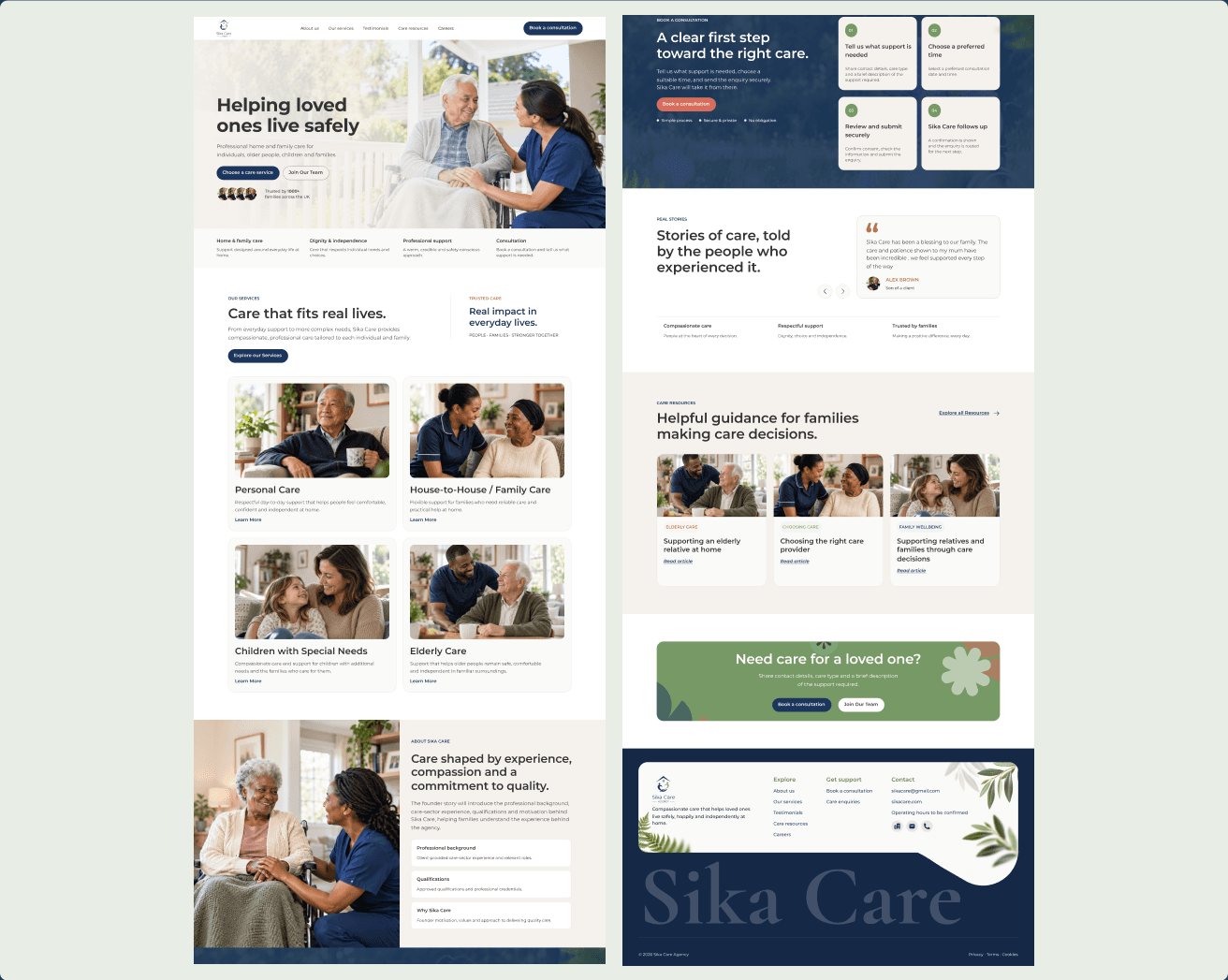
A warm, trustworthy digital experience that helps families understand their care options and take the next step with confidence.
The context / 01
They often begin with questions.
What kind of support is needed? Can this provider be trusted? Will they understand the person behind the care requirement? And what happens after an enquiry is submitted?
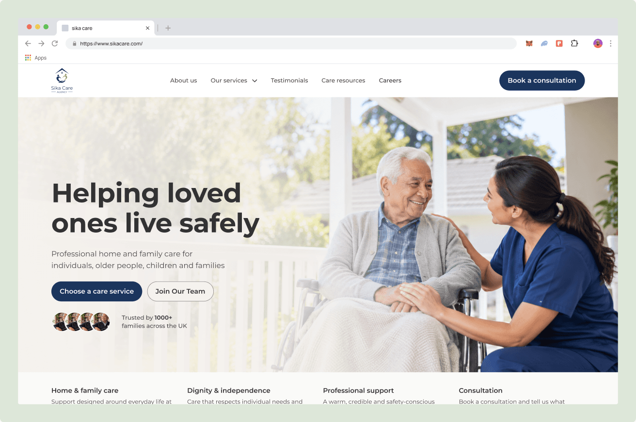
SikaCare needed a website that could answer those questions without overwhelming visitors. It had to introduce the agency, explain its services, demonstrate professional credibility, support recruitment, and make it easy for families to begin a conversation.
But more importantly, the experience needed to feel like SikaCare itself: compassionate, respectful, dependable, and human.
The challenge / 02
The website had several jobs to do at once.
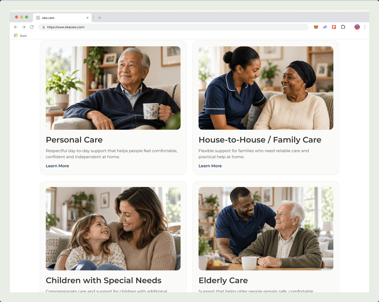
It needed to reassure families, explain four different care services, present the founder’s professional background, generate consultation enquiries, support care-professional recruitment, publish useful resources, and handle personal information responsibly.
These requirements created an important design tension: how do we make the experience emotionally warm without losing clarity, credibility, or structure?
01
Visitors needed meaningful reasons to trust the agency before being asked to complete a form.
02
Service information had to remain detailed enough to be useful without becoming clinical or overwhelming.
03
A family seeking care and a professional seeking employment arrive with very different needs.
04
Consultation and recruitment journeys needed to be visible, simple, and reassuring.
The audience / 04
SikaCare serves more than one audience, but each visitor needs to feel understood quickly.
01
Need service information, trust signals, an easy way to begin a discussion, and a clear sense of what happens next.
Understand → Evaluate → Book
02
Need language centred on dignity, independence, choice, and support that respects the whole person.
Explore → Feel seen → Enquire
03
Need role information and a secure CV application journey—separate in purpose, consistent in brand.
Discover → Assess → Apply
Information architecture / 05
The website was structured to meet visitors at different stages—whether they were beginning to understand care, comparing services, ready to book, or exploring a career.
01
Arrive
02
Understand care
03
Build confidence
04
Choose support
05
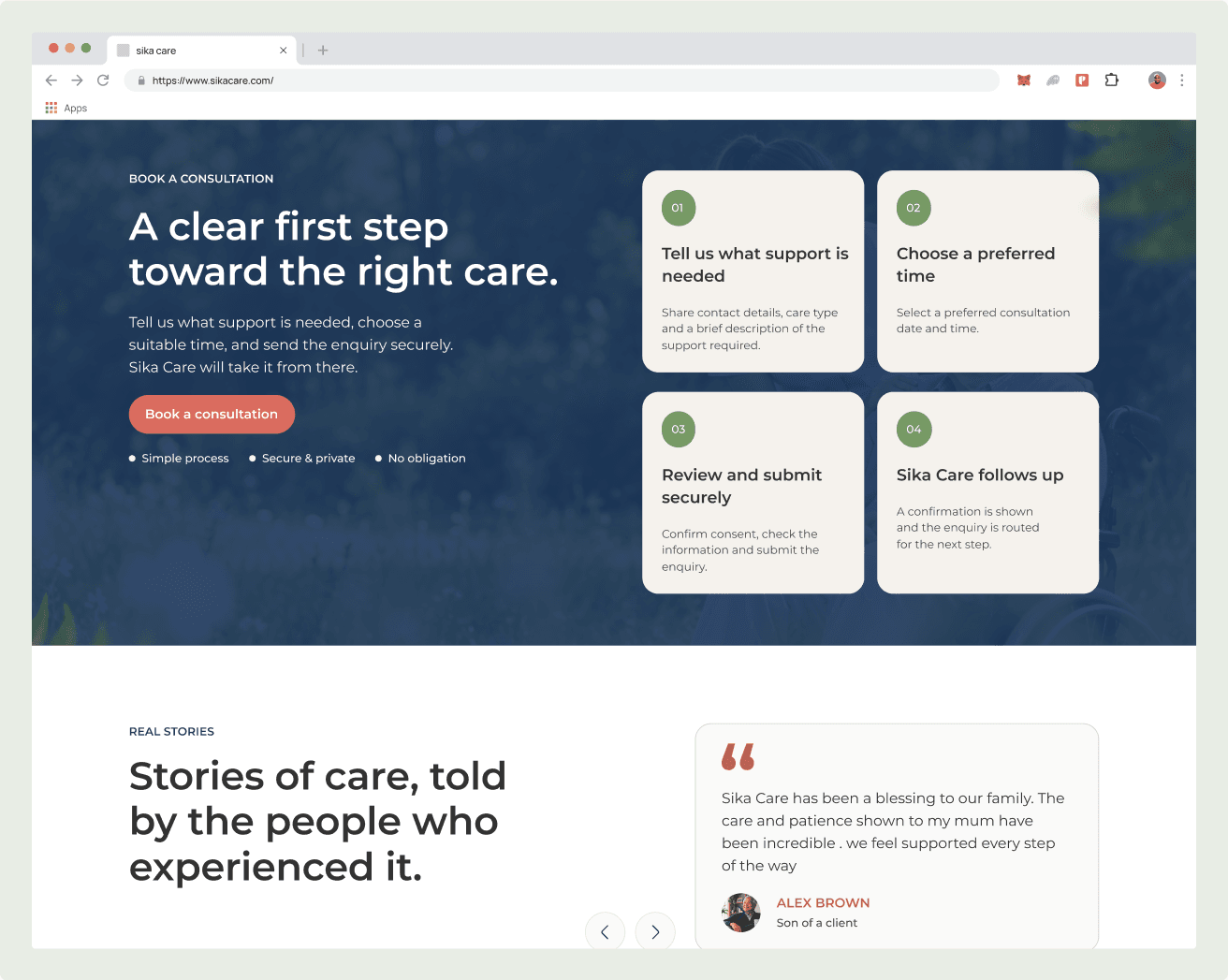
Book consultation
Brand expression / 08
The visual system balances reassurance with competence. Montserrat keeps the product experience direct and legible; human photography centres connection and dignity; botanical elements appear selectively around calls to action and the footer, where warmth can support rather than distract.
Classic Navy
Authority
Sage Green
Wellbeing
Warm Ivory
Comfort
Coral
Human accent
Charcoal
Readability
The experience / 06
We organised the experience around what visitors need most: understanding their options, finding reasons to trust the agency and knowing how to get started.
The website also accommodates prospective care professionals, providing a dedicated route to explore opportunities and apply.
Across desktop and mobile, the design maintains a consistent visual language, keeping the experience familiar wherever visitors begin their journey.
Credibility / 10
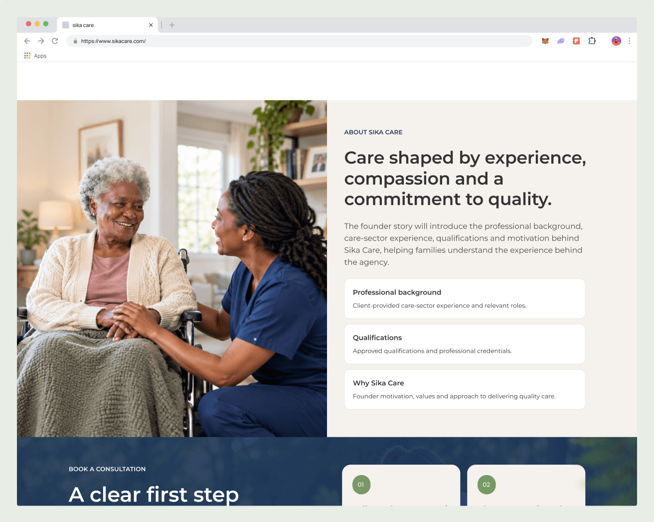
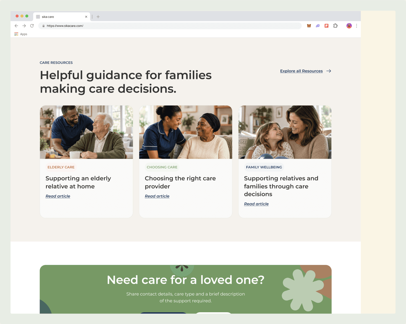
Trust is built through the founder’s story, practical service detail, testimonials, useful care resources, and clear privacy and legal information. Each signal reinforces the others, so credibility is carried across the whole experience.
01
Professional background and motivation.
02
Lived reassurance from families.
03
Useful guidance before an enquiry.
04
Practical answers, not vague promises.
05
Responsible handling of personal data.